
What makes this project unique?
Allowed me to collaborate & network with many teams across T-Mobile
T-Mobile Uncarrier move; advertised at Superbowl 2024

Problem
Customers do not see T-Mobile as a brand that offers benefits outside of phone plans because we do not have a place for customers to learn about and enroll in benefits & subscriptions.
Customers feel like a (phone) number and this causes them to leave T-Mobile.
Solution
Create a personalized, easy to navigate benefits hub where customers can learn about and enroll in benefits & subscriptions.
“I call customer service if I have to manage or add benefits, I’m not sure where I’d find that information online. ”
Key skills
Adaptability
I saw this product through scope changes, name changes, & team transitions
Galvanizing
I had to get buy in from many marketing teams & senior leadership
Compromise
I approached every design decision & review with outlining the best user scenario, as well as how we could compromise to prioritize other teams’ goals without hurting the UX

Timeline
I joined this project in September 2022
Led UX strategy through several name & scope changes (Little Si, SMP, Md0ve)
Became a mini subject matter expert. As the team member who worked on the project the longest, I held a lot of information & contacts

My roles
Lead Product Designer - Web & web-wrapped experiences
Subscription & product history expert
Design Project Manager (Temporary, ad-hoc, to fill a gap)
Collecting data metics after “my involvement” ends

Process
We’ve all seen the tidy process, with arrows to show vaguely iteration. I like it with these icons…

… but we all know that’s never how it goes.


Discovery
From past customer research during Little Si, I identified some key insights on T-Mobile customer’s behavior around benefits.
I conducted a heuristic review of the existing, static, benefits page, and developed 2 personas.
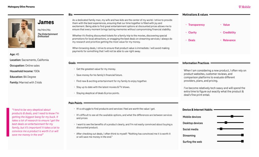
Personas

Customer journey
Initial white boarding sessions to defining the flow.

Journey

Web-wrapped flows
We collaborated with designers who designed Magenta Status for the T-Mobile app. Engineering only had capacity to develop the Magenta Status screen itself, so my team was in charge of identifying the in production pages for each subscription to create a web-wrapped experience. This included light copy and hierarchy lifts to our in production pages, as well as gathering third party flows for the non T-Mobile portion of the subscriptions or benefits offered.
I had 2 other UX and 1 content designer devoted to this effort. I managed communication with product teams, created design schedules & reviews, and compiled the final design documentation for hand off.


Designs
App

Card creation, navigation, & filters


Web

Final design


Testing
Content comprehension test
Moderated study consisting of usability testing a prototype focused on card interactions.
Participants were asked to sign up, find, cancel, add, and upgrade certain benefits on the Benefit Hub page.
Findings:
The Unified Benefit Hub (benefits + subscriptions) was more effective in enabling the participants to find and manage their benefits, subscriptions, and add-ons
Starting points to find and manage a service depended on participants’ awareness and prior knowledge about whether a given service was a plan benefit or add-on
Many participants were not aware of the distinction between “benefit” and “subscription” and found the distinction often confusing and unnecessary
The distinction between “On Us” and “Included” were not clear to many participants
Benefits Hub Page
Moderated study consisting of usability testing a prototype of the entire experience.
Participants understood which benefits were free and which benefits were discounted
Findings:
It was not confusing to participants to see a benefit in multiple categories.
Participants discovered different entry points to manage their benefits and add-ons.
Many participants expected to find all the benefits under Benefits Hub and the benefits that they had subscribed to under Subscriptions.
Many participants spent some time to figure out in what ways Benefits Hub and Subscriptions were similar and different.
Some participants were not aware which of the section (Benefits Hub vs Subscriptions) they preselected at times.
Many participants found the overlap between the Benefit Hub and Subscriptions inefficient and found the separate sections unnecessary.
Initial results
After the release of Magenta Status on Oct 10, 2023, customers can now discover and see the benefits of their T-Mobile rate plan.
Magenta Status received over 90% unique visitors alone (58% web, 42% apps) without special marketing and social/employee communications’
Users started engaging with and learning more about their benefits. Top 5 benefits card clicked on the release date included:
Inflight Connection (1.2K)
Apple TV+ 6-mo Trial (1.3K)
Data & Texting while Abroad (2.6K)
Apple TV+ On Us (3.4K)
Netflix On Us (10.8K)
Testing (6 months later)
Moderated usability study that validated discoverability concerns UX had expressed, but were pushed to compromise for marketing motivation.
Marketing carousel usability
Filter discoverability
Understanding whether benefits were already applied or needed action
Terminolgy clarity


