
Demo: Phone
Demo: Watch
What makes this project unique?
Designing for AR
Started as a Hackathon idea & got funding to be fleshed out
Collaborated with T-Mobile’s Innovation team (InLab), T-Mobile’s VP of Design, & third party AR developer (Paper Triangles)
Solution
Create an augmented reality shopping experience that customers will find intuitive & helpful; while leading them to make a purchase.
Problem
The e-commerce shopping experience leaves the customers less confident about purchasing a device online than in stores.
How might we raise the product confidence of online shoppers?
My Role and process
Lead UX Designer. AR Handfit began as a hackathon idea, but with all creators leaving the company, I became involved 3 months later to pick up where they left off. Working closely with product, I began by organizing all previous research, creating a timeline for iterations and testing, and building a stakeholder workshop. The plan was to run a survey, distill the workshop + survey findings into wires, and then run a moderated usability test. Then I updated the prototype with those findings, and we ran the moderated tests once more. At this point, we were still negotiating the contract with Paper Triangles. Ideally, Paper Triangles would have been involved earlier in the process, however collaborating with Paper Triangles was an amazing learning experience and provided us the opportunity to work with experienced AR developers. I began design in Figma and later switched to Photoshop to make this collaboration smoother.
Research


I began with ideation from these user interviews, developed personas, and launched into competitor analysis.
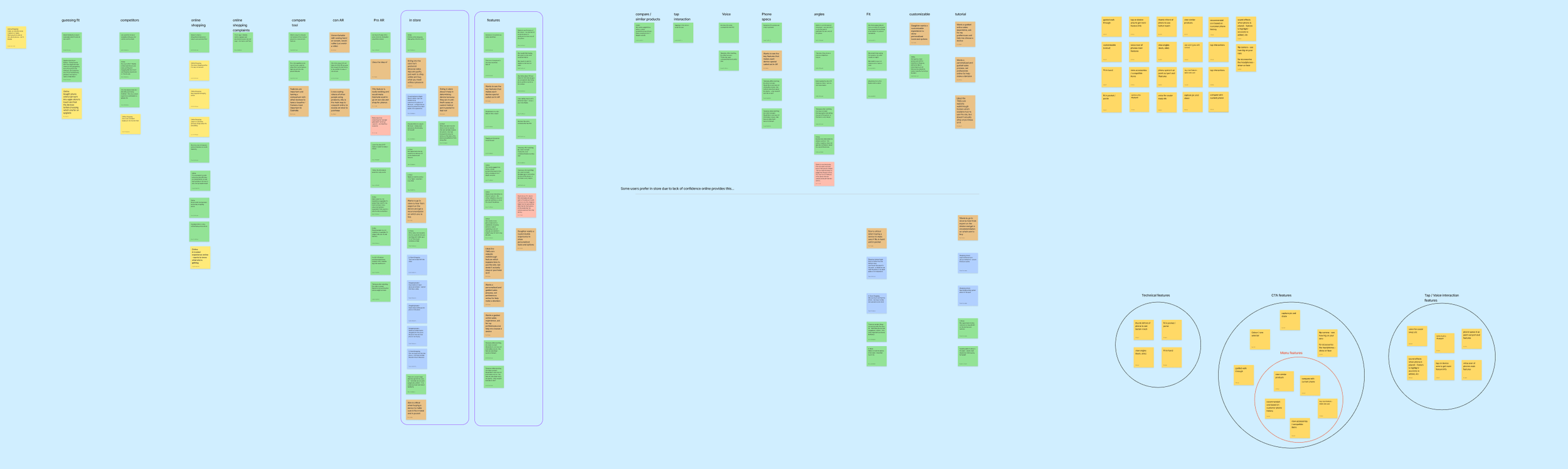
Afinity mapping of initial user interviews & competitor analysis data.

Desired features entering stakeholder workshop.

Set up for stakeholder workshop
Design thinking workshop
3 stages
Impact vs effort graph - I set up all the stakeholders with feature stickies to put on the graph in accordance with their perspective, with the option of writing a new feature idea in or leaving clarifying comments. We took the next 10 minutes to go through the graph together and decide on 1st, 2nd, & 3rd iteration features.
Ideation - I asked the stakeholders to pick their top features and imagine what it would look like. I included icons and CTAs for them to assemble on the phone.
How might we and assumptions - Together we talked through our feature prioritization from exercise 1 and brainstormed ‘How might we’s and current assumptions for each one. We then discussed what’s next in terms of needs and exploration.

After stakeholder workshop
Features
1st iteration
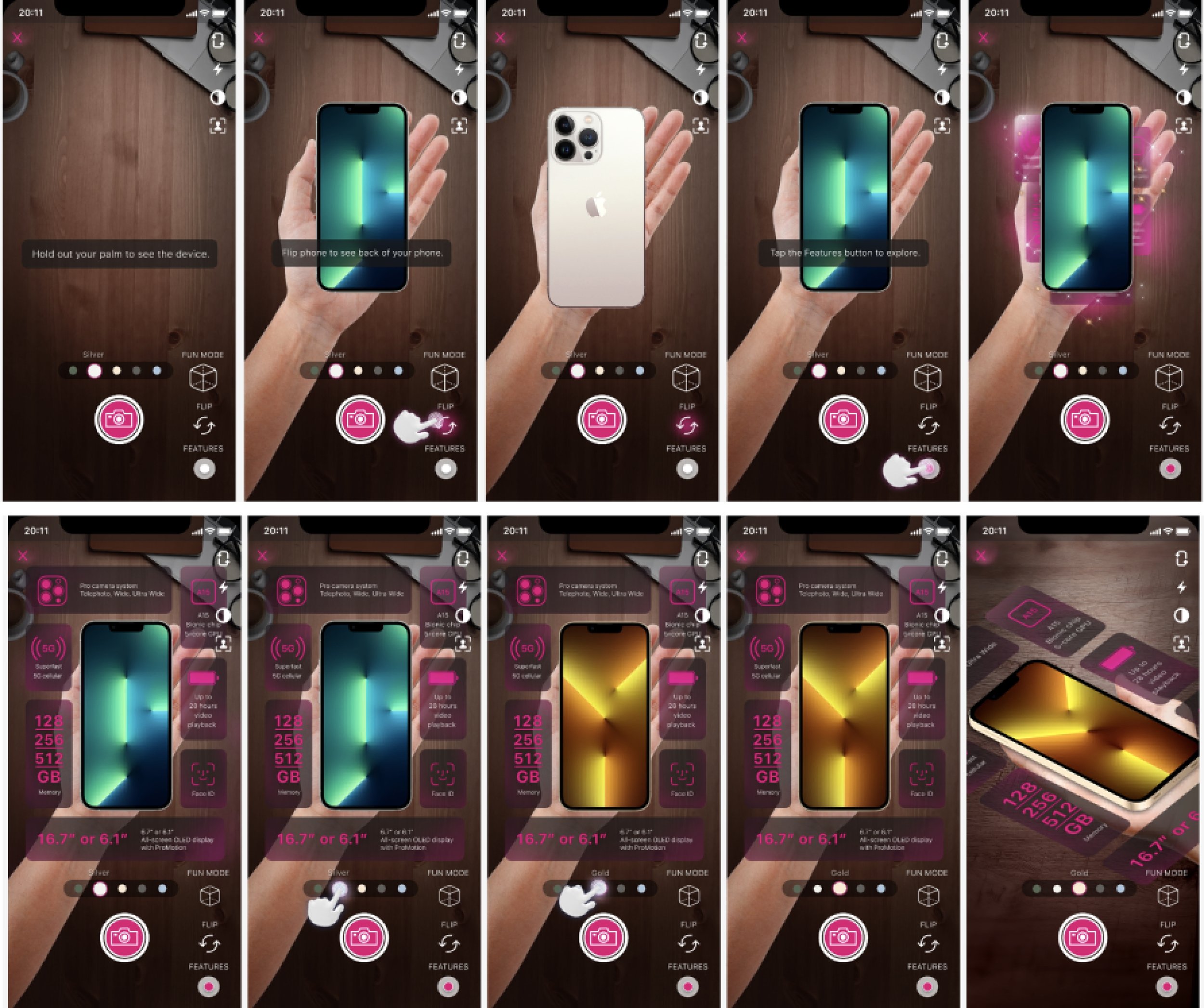
Fit phone in hand
Flip phone to view back
2nd iteration
Tutorial
Color selection
Feature highlights
Snapshot & share
Voice activation for the CTAs
3rd iteration
Display other products
Compare devices & objects
Add to cart
User Flow

I included all iterative features for a full experience and added the end-to-end customer journey.
Wireframes & Mock ups
To the right is the product description page, where the can begin the AR experience. I added an icon and text to incite interaction.
The below wires and mock ups will be organized by feature and chronological iteration, with final UI displayed at the end.
As we user tested, iterated, and more closely understood dev restrictions, we called the MVP the “Browsing Experience,”
and the road map the “Shopping Experience.” The main difference being that the Shopping Experience allows users to switch between and compare products, including devices on their current account if the are a T-Mobile customer already.

Flip phone

1st iteration

Browsing experience
Tutorial

1st iteration.
Interaction: Many conversations around whether the tutorial should start when AR is launched or if it should be triggered by inactivity or initial taps by the user.

Shopping experience.
Color selector

1st iteration. Interaction: Tap maximizes selector, tap selects color and selector minimizes. AND Tap selector, drag to desired color, release to minimize.

Browsing experience variations

Shopping experience variation
Feature highlights

1st iteration

Browsing experience
Snapshot & share

1st iteration

Browsing experience - utilizing Snap SDK
Add to cart

1st iteration
In the 1st round of user testing, the “Add to cart” feature was a priority to some users, though some didn’t like it because they could simply exit the experience to the product description page to add to cart.
I liked this feature and drew wires for the user to pick memory etc, but ultimately decided to cut it due to how complicated it was getting for the MVP.
Within the roadmap, I noted that this feature would make more sense down the line if users were able to switch between products within the AR experience and should be re tested with users.
Final UI
Once we began working with Paper Triangles, I switched to photoshop and together we tackled making update based on stakeholders & user testing, and begun UI revisions.

V1 with Paper Triangles’ input
Final updates
In the above version, we added the “switch hands” feature to accommodate left handed users. Ultimately, the VP decided it was unnecessary.
The color selector changed from a wheel to a straight line. I liked both selector designs, but was pushing for the circle design & swipe interaction.
I recommended to increase font size and make underlays more opaque, however we ultimately just took out the magenta glow and modified the icons.
Fun Mode was originally proposed by Paper Triangles to keep in the spirit of AR (snapchat). We decided to develop this last, fun mode ideation include:
Filters for the users hand / flip the camera, phone goes to ear, and wig filters can be swiped.
T-Mobile store & city buildings grow out of phone and a monthly promotion for a T-Mobile product appears.
Final phone designs

Final watch designs
What I’ve learned
How to best design for AR developers.
Advocating for accessibility can be an uphill battle, even at companies who prioritize accessibility.
How to write a contractual addition to a SOW.