Summary
Metro by T-Mobile’s customer support pages were lacking in discoverability and search-ability. When this project came to me, the goal was to assess and design a solution to improve the Customer Support experience. As Metro was a newly brought in-house design team, Product was used to quick turn around and dictating many of the features. This is a successful project of mine because I was able to fight for the time to conduct research, as well as the end results showing an improvement in customer satisfaction and a lower bounce rate for the pages.
Solution
Highlight FAQS, establish Information Architecture into interactive “Support topics”
Clear header
Introduce search feature
Create dynamic quicklinks
Problems
No clear header
Hidden, inaccessible FAQs
Many dead ends and links
Redundant pages and links
Stakeholder requirements
Product stakeholders were originally the sole stakeholders; they battled us on the need for for conducting research for this project, but with the right planning and timeline we arrived on several studies. After outlining the project plan, we realized this effected more teams, and we included the Nuance Team, Support Content team, and Customer CARE Online Experts. I would meet with the project stakeholders weekly to discuss the projects, changing factors on the business side, and conduct stakeholder workshops. As a team with two UX Researches and one other UX Designer, we found the most success with stakeholder involvement when holding a 3 hour workshop (originally 6 hours - unfortunately compromised and whittled down for time) and we could get everyone drawing and writing to develop their ideas.
My Role and process
I was the lead designer, working with a mid-level designer who I had just onboarded onto the team. I began this project by doing a heuristic analysis and competitive analysis. At that point, I synced up with the UX Researchers on our team to collect existing surveys and analytics, before then developing a research plan. After research, I created a Customer Journey and user flows. I delegated parts of the flow to the other designer, and then we came together to workshop and ideate on the lo-fi wireframes we created. From there, it took many stakeholder meetings, revisiting the Customer Journey, and reiterating potential designs; but we created a esteemed prototype that is currently in development.
Before

“Support & Contact” page, accessible from global nav

“Frequently Asked Questions” page, only accessible for footer
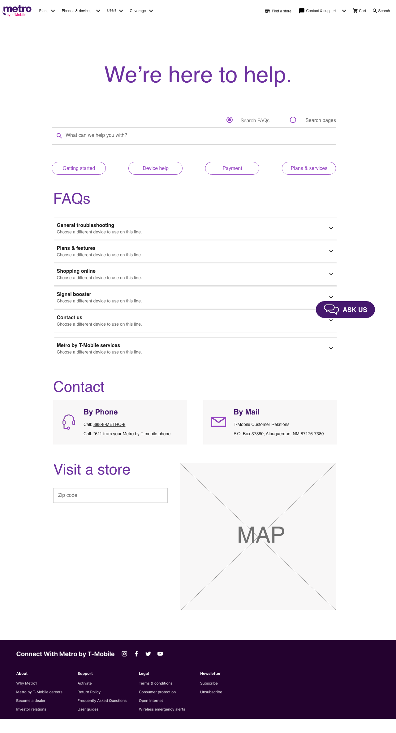
After

Above is the new “Support & Contact” page, featuring 4 main Support topics that include all FAQs. If a user clicks into the Support Topics, the page will look like the screen to the right of the main page “Troubleshooting.” These secondary pages feature blades with more specific categories, and Related Topics. Under this screen is an example of custom tertiary pages, accessed through the blades.
Below is some templates I made for possible tertiary pages.


Mobile


Research


As mentioned, before syncing up with the UX Researchers on the team, I conducted a heuristic review and content inventory of the current Metro support page, followed by a competitor review and some affinity mapping to view and summarize my key findings and opportunities.

Affinity map of Competitor review
Key findings
The largest issues with the current website were poor visual design as well as lack of discoverability of the FAQ page and search function.
The prototype confirmed our assumptions in improving the support experience. The design made it easier for participants to locate the FAQ page, and less effort to find relevant information on it due to the organized layout and search capability.
Content organization is still an issue and must be improved to make it easier to locate the necessary information.
Most participants preferred to talk to someone when seeking support rather than browsing for the information on their own, while three out of the seven typically choose to google search the information. Reading written information on the site is not something they pursue right away.
Two factors of concern when seeking support is time and money, no one wants to feel like they have wasted either.
When participants were asked about the mediums of content they’d like for support, they mentioned the advantage in having a video for self-troubleshooting to quickly and easily give them the information they need.
Opportunities
Consider linking videos or visual documentation to help participants self-troubleshoot for some issues
In the answers portions, hyperlink any relevant information and keep them succinct or easy to read
The categories may need to be re-named. Perhaps another study such as a card sort to determine the best way to structure the content.
Add more entry points to the support pages
Think of more strategies or ideas to incentivize customers to seek their support experience online
Content inventory & Original FAQ page chaos
I took the 180+ questions from the FAQ page and logged them in a content inventory of everything related to Support. Note below to the right, how the original FAQ page had three layers of accordion within accordion, sometimes displaying the same title or even having up to 19 individual questions mushed together on the third accordion.


FAQ page
(The device emulator was a great idea, but it didn’t work. We reused the intent and implemented a working version; discoverable by search or within “Troubleshooting”)
Sitemap
We continued our research with a card sort and tree test of the FAQs, resulting in the below sitemap.

Workshop
We coordinated ~12 stakeholders schedules so we could hold a 3 hour workshop. During this workshop, we ran through 3 activities:
1. The Good, The Bad, The Ugly (20 mins.):
We had a Miro Board set up with stickies of data point gathered thus far. They were unsorted and next to a “Pros and Cons” section, we asked participants to review and cluster the data where it fit and with others related to them. They could also use this time to add any other stickies or observational notes.
The exercise repeats with an “Inspiration” section to take notes or sort stickies. After 10 min of silent sorting time, we had 10 min of discussion. This ended with the group deciding on labels for each group.
2a. What If (diverge) ideation (15 mins.)
For this activity we split the group into 2. Participants had 8 min to sketch out any ideas around Metro Support that they had. Next we took 7 min to discuss and pick our favourite ideas as a group, and finally everyone had 3 votes to pick the top ideas.
2b. What If (improve) ideation (15 mins.)
Now participants had the chance to take your most voted solutions, and add their own ideas to build off them. They had 8 mins to write/sketch/upload your ideas, then 7 min to discuss and vote (3) on the top solutions.
3. How-Now-Wow Matrix (10 mins.)
We had a matrix set up on each group’s board, and ask them to sort the top solutions into “Love it but How would we do this?” “Low effort, high impact, achievable Now” and “Wow that would be a game changer - but would take a few steps to get there” categories. If they wanted to and had time, they could bring other solutions that may not have had the highest votes into the matrix.
We reunited the group and discussed the solutions.
As much as this would have been more beneficial if we could have gotten more stakeholders’ time, it was invaluable to the process.
We took the board into consideration for the next stage of wireframes.
Lofi wireframes for more usability testing
We then created a lofi prototype for mediated user interviews, which I was able to sit in and take notes on via Userzoom.